Friday, 13 December 2013

Exploring a feature article

In class I have analysed the linguistic features of a Kerrang! feature article on the band 'THE USED' as well as looking at the layout and conventions to help inform my own feature article...


At the start of the lesson we read through parts of the article on the band 'THE USED'. Then to help when it comes to creating our own articles we had to come up with a headline and a stand first for 'THE USED' article. Here are some of the headlines and stand first...

Headlines
  • Interrupted, corrupted 
  • The medical mystery of Bert Mccarcken 
  • Confused, The Used 
Stand first 
  • mad, abnormal or just plain brilliance? 
  • Is Bert Mccracken a new music genius or just a typical druggie ?
  • Is Bert Mccracken really 10/6 or is he pulling a trick out of a hat.
  • The exclusive interview inside the mind  of  Bert Mccracken and the rest of the used. 
The articles linguistic features consist of switching between question and answer, this gives the sense as if the readers are part of the interview and as if they are sat in the room. 

Friday, 6 December 2013

Research and analysis of music magazine pages

Here is my analysis of....

The key learning points about front covers are...


The key learning points about contents pages are...


The key learning points about feature articles are...


How will it inform my work?

Looking into these front covers,contents page and feature articles will help to inform my work as I have  greater understanding of the conventions of music magazine pages. Also looking at these pages in detail has given me new ideas and inspired and has helped to inform my ideas for my own music magazine.

Tuesday, 3 December 2013

Prelim task review

Prelim Task - Final outcome

Here are my finished prelim task outcomes - Sixth Form magazine and contents page


You can find below my Prezi which analyses all the aspects of my prelim task.


Thursday, 7 November 2013

Planning ideas for Sixth Form Magazine


Planning ideas for Sixth Form Magazine

Here are my ideas for the front cover of my Sixth Form Magazine including taking into consideration elements of Mise-en-scene:

The Masthead for my Sixth Form Magazine is FUSION which will dominate the left and middle top thirds in a black or deep navy blue serif font.
 I also had other ideas for my Masthead such as;
  • Imprint 
  • F.A.S.F 
  • 1.2.3
  • Falli Fusion
  • 6th print 
  • Fusion
Ideas for cover page; 
  • In the right top third of my cover is the issue number and date of my magazine which is vertical text.
  • Underneath my Masthead , is a tag line 'Fallibroome's Fantastic, Fresh ,New 6th From Magazine' 
  • The cover line of  'WINTER BALL WONDER' dominates most of the bottom three thirds, with a short tag line underneath of 'Confused on what to wear' 
  • The image for the front cover is a medium close up of a girl predominantly place inn the right and center thirds. 
  • The costume, will be a formal dress such as for the winter ball , however the model will wear a bow tie as to relate to the story of 'Confused on what to wear' , the make up will be elegant to match the theme of the 'ball'. the models hair will be loose and flowing in an elegant style. 
  • Where as I also have another idea for the costume of  having the model in a shirt and bow tie, with a tight black strapless dress pulled up to low chest line. This relates to the story of being 'confused on what to wear' 
  • The facial expression of the model will be looking confused.
  • The back ground will be white to a light cream, to contrast against the dark front on models clothes.With some shadow from the model. 
  • The extra cover lines in the left third of the cover will in deep blues and light red fonts 
  • There will be a menu trip along the bottom thirds , advertising revision techniques and study skills.
  •  The Winter ball aspect as the main story in the magazine. The models costume will be black,white and may also have some blue to tie in with the cool contemporary colour scheme.
  • Ideas on Winter ball fashion 
  • What to do after Sixth Form 
  • Ideas on music, movies etc. 
  • Driving lessons 
  • Revision techniques and study skills 

Type faces for Masthead;

I chose FUSION as my magazine is a Sixth Form Magazine for school I also wanted to incorporate fashion, music, movies etc. into the magazine as if its a fusion of school and lifestyle. 

These are some of the font ideas for my Masthead, I chose fonts that were Serfi and that looked like  a collage/school type font, I chose fonts that were bold and that stand out for my Masthead. My three most favourite fonts from the ones above are;

'Friday Night Lights' I like this font as it looks like a classic collage font, I like the white outline of the font and the effect of the font that seems like lights.
'Campus Relief' I like this font as the black bold outline makes the font stand out more, I like the drop shadow on the font. The font looks similar to classic collage fonts however I like it because it doesn't fully resemble a classic collage font.
'Retrohand' This is my favourite font out of the three fonts as I like the style of the font.I like the way it looks like some of the letters have been stitched together and look slightly jumbled up.

Colour Schemes; 

For my colour scheme I wanted some simple colours like creams and then other colours that were bright and stand out. My favourite ones are the third one and the fifth one, as I like the third one as I like calm colours of the white and the cream/grey. I also like the brightness of the blue and the lilac as they stand out from the other colours. I like the fifth one because I like the lighter colours as they contrast against the light pink and deep red. 


Ideas for the contents page; 

  • Images of winter ball 
  • image of 'scenes from the silver screens'
  • university application/ ucas /revision techniques 
  • images of students studying 
  • someone looking confused 
  • someone looking stressed
  • image of sixth form logo
  • pictures have numbers allocated to story titles on the page. 

Wednesday, 16 October 2013

Research into School/Sixth From magazines

I am conducting some research into various Sixth from magazines and School , As part of my preliminary task I must make a Sixth from magazine. I wish to learn more about the key conventions used and what makes a successful Sixth form/School magazine.

Here is a word cloud of some key conventions/points to consider when designing  a Sixth from/school magazine.


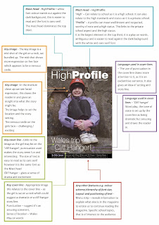
To learn more about Sixth form magazines and further my knowledge of the conventions of sixth form magazines I have found and analysed some Sixth from magazines from other schools. I have analysed the front cover of the High Profile magazine from KEHS - King Edward VI High School For Girls - kehs.org.uk

Next I then analysed the front cover of  Comberton Sixth form magazine - 'The First' -combertonsixthform.org
To further my knowledge into Sixth form magazines I also analysed the front cover of  the Stoke Newington's Sixth form magazine - 'Spotlight' - sns.hackney.sch.uk 
I have also analysed the contents page of the 'Spotlight' magazine as for the preliminary task as well as producing a front cover I must produce a contents page to accompany it -sns.hackney.sch.uk/contents
I have made a word cloud of all the key conventions of a magazine front cover and contents page.


The magazine that I like the most is 'The First'. I like this as I find it more eye catching and interesting. The image on the front cover ties in well with the edition as its winter, its a very detailed and good quality image. 


Thursday, 10 October 2013

Introduction

My name is Heather , I am a A level Media Student Studying at the The Fallibroome Academy.

This bog charts my progress in response to AS coursework brief PRINT

This is my AS coursework PRINT brief blog.
The brief is:
a preliminary task - to produce the front cover and contents page of a new school magazine, featuring a photograph of a student in MCU plus some appropriately laid out text and master head.

The main task is to design the front over, contents and double page spread of a new music magazine which is to include a minimum of 4 original images.